Macro Made
Branding & Identity | Print | Art Direction
Macro Made is a conceptual company created with the goal of educating individuals looking to take a further step in their health journey. A smoothie machine on wheels, Macro Made tours the country in an interactive food truck in which users get to calculate their macros and order a smooth with that exact breakdown to drive the idea home that health can be tasty and easy!
In the workout realm there is a real disconnect between the people that are just starting their fitness journeys and the people that have “made it.” With all the fad diets going on, sugar being good one day, then bad the next day, it is really hard to know what is actually true and what is just “in” for the moment. (I’m looking at you avo toast.)
The Problem:
The aim of this truck is to travel to parks, expos, gyms, and educate people about macros in a fun and interactive way in hopes that the experience leaves the user with a better understanding of what macros are and how to get them started counting their own macros.
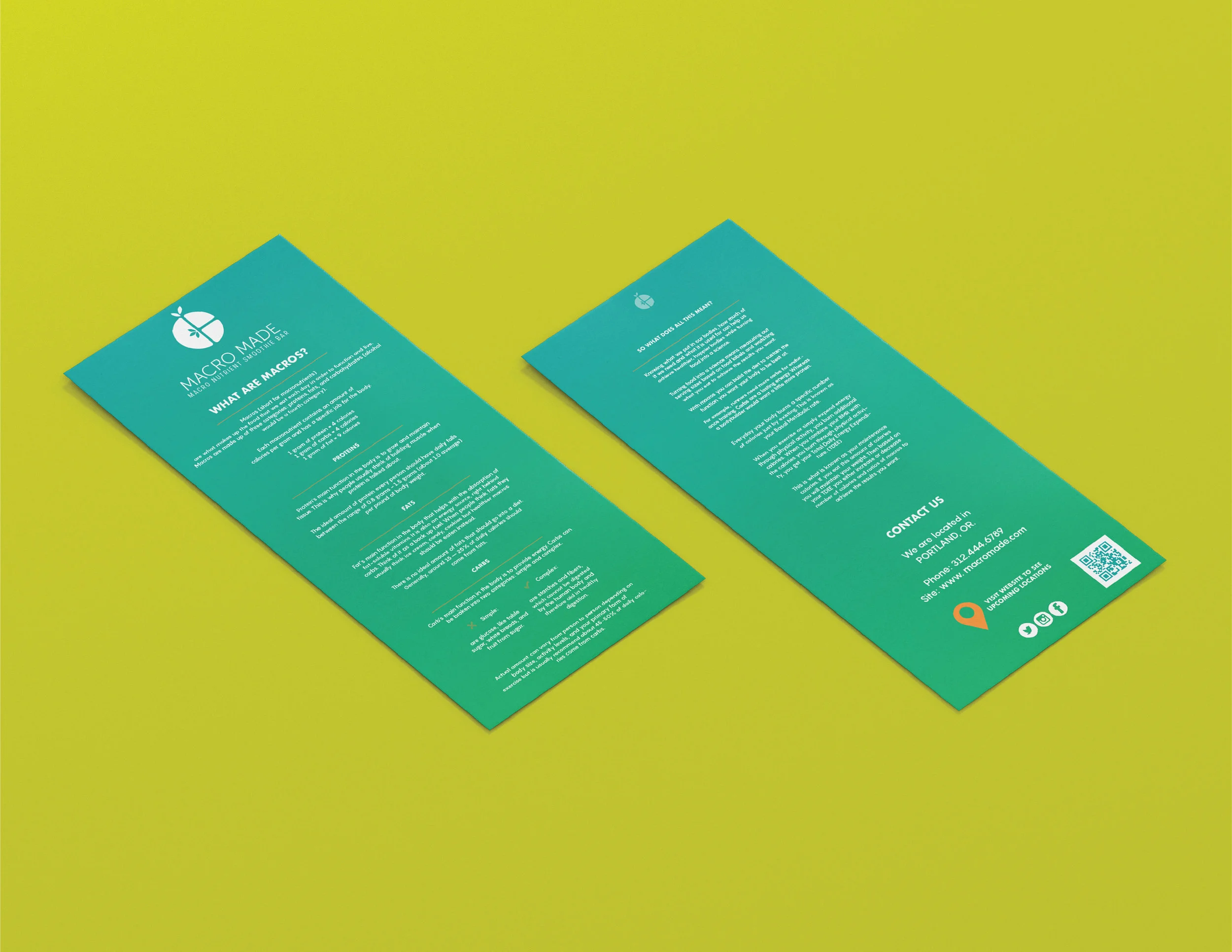
The experience is sequential in three parts. First the user takes an interactive quiz on the ipads/touch screens provided. Then this quiz then prints out a receipt with the users macro breakdown that, now, becomes a piece of educational, collateral the user is able to take with them. The final step is presenting this receipt to the smoothie maker inside. Based on the user’s breakdown, the maker will give smoothie recommendations in align with their newly calculated macros.
Interactive, informative and tasty! Who said healthy has to be bland?
The Solution:
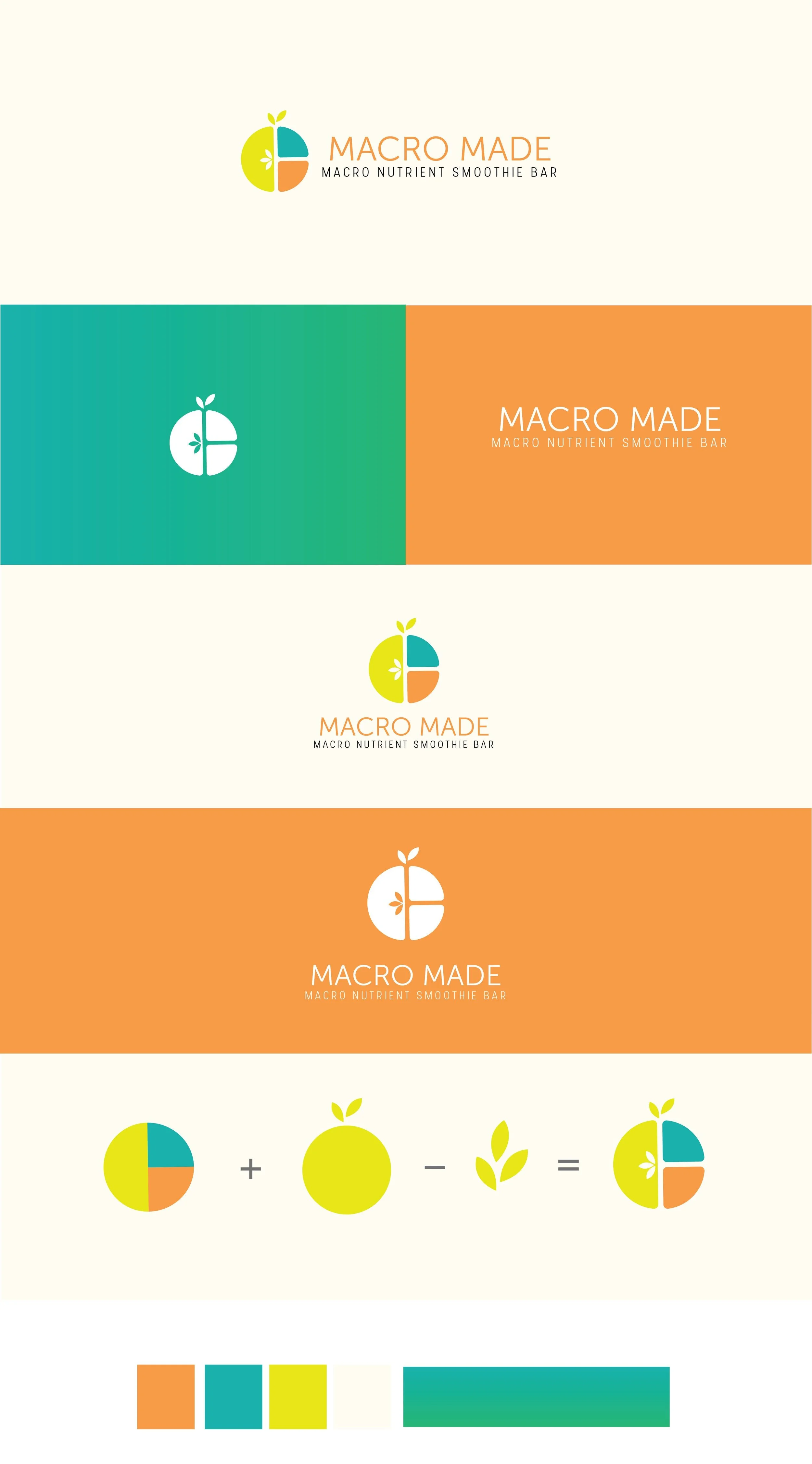
BRANDING IDENTITY
Clean typography and a bright and fun color palette.
Once a customer takes the macro questionnaire, they have the option to either email their macros to themselves, print their macro receipt to take with them, or both! They can show this receipt to a macro maker and the macro maker can give them a recommendation based on their breakdown.


